A CRO Case Study:
Royal Jordanian
Engage our industry experts as your outsourced marketing department (for a fraction of the cost)
Using Customer Behaviour Data To Grow Sales
Goal: Conversion Rate Optimisation seeks to find the structure of a given website or page which results in the highest number of conversions. It sits nearest to the end of the conversion pathway, typically resulting in the best return-on-investment of any marketing activity.
Royal Jordanian (RJ) engaged Cherryielding (CY) to increase its online bookings through the web platform. Given that Amadeus has tight controls over the booking funnel itself, analysis was focused on the pages which had the closest touch points to transferring into the booking funnel; the ‘membrane’ between the website and the booking system. The more people which are transferred into the system, the greater the number of subsequent conversions.
The Approach
Ten pages were selected for quantitative data capture. Different page templates were included within this selection in addition to inputs from RJ which will be taken on board for selection. Capture typically happens across a two week period, but for some pages lasted an extended amount of time, until Cherryielding was confident the number of pageviews was statistically significant.

Key CRO service highlights:
– We continually test pages across the whole website for you.
– We simply connect up to your Google Tag Manager and add our advanced tracking tools and experiment software (Google Optimize).
– We don’t need access to you CMS.
– We don’t need your development team to build test pages either!
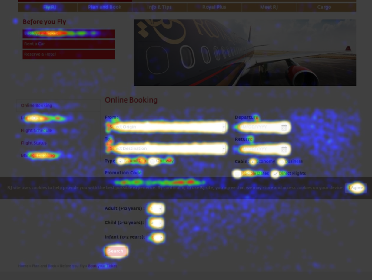
Heat Map Technology. Heat Maps were used as a key part of analysis. A pretty straightforward concept, the more clicks a certain button or area of the page received, the ‘brighter’ that section of the image is. The bright white and yellow sections in these images convey that they received the most customer attention (i.e. clicks) within the experiment.

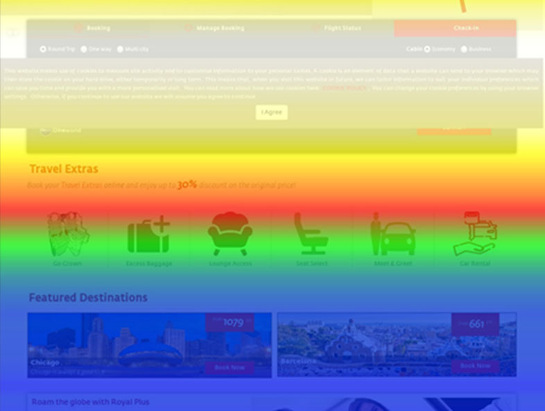
Scroll Maps. A scroll map is a method used to understand which sections of a given web page a customer is most likely to see, or most likely to skim over and miss. The image for each uses a relative colour scheme, with yellow and white sections the most visible parts of a page for customers. In the ‘colder’ green and blue sections only a lesser percentage of customers saw this section of the content, 50% and 25% respectively for each colour. The guide right shows these percentages quite clearly.

The Results
At the conclusion of the initial experiments there was a calculated, absolute uplift of approximately 0.7% to the home page conversion rate. These additional conversions were seen just in the first couple of weeks during the first project. Over the course of a standard year this uplift is likely to result in hundreds of additional conversions. This meant we were able to achieve a break-even for the project within the first two weeks.
With the best method of CRO being to continuously refinine elements over a period of time, it’s fair to say a longer period of time would have yielded even stronger results!
GET IN TOUCH
Learn about our approach to measurable, ROI-driven marketing today


